
How To Build High Converting Ecommerce Category Pages (Best Practices)
High-converting ecommerce category pages are built by combining clear visual design, strong UX/UI, and conversion-focused elements that guide users from browsing to buying.
Effective category pages use scannable layouts, high-quality product images, essential product attributes (price, name, ratings), intuitive navigation, filters, and search, all supported by trust signals like reviews and shipping benefits.
This category-page —design → usability → persuasion—helps shoppers quickly find the right products while increasing engagement, conversions, and SEO performance.
In this article, we are going to discuss the ecommerce category page best practices.
So, if you’re ready to do the work required to make your ecommerce category pages the best they can be, the following are the practices you should try to follow.
Ecommerce Category Page Design Best Practices
There are many benefits of investing in first-rate web design. Getting it right can help you impress first-time website visitors, position your brand as authoritative, trustworthy, and unique, improve search rankings, and drive conversions.
So, it’s only natural that when optimizing ecommerce category pages, you should aim to maximize their visual appeal.
The great thing is that there’s a lot you can do on your own if you wish to improve the aesthetic appeal of your category pages. In fact, the best practices listed below will help you cover your bases.
But if you want to guarantee next-level conversion rates, don’t hesitate to employ the services of an experienced website development company.
Scannability
The first thing to remember when building ecommerce category pages is that people don’t read online. Instead, they scan pages for information relevant to their experience.
So, as you explore the best practices for designing these assets, the most important thing to remember is to prioritize scannability.
The great thing is that this is relatively easy to achieve on category pages. All you have to do is:
- Use H1 and H2 heading styles to allow product names/subcategories to stand out.
- Aim for a high readability score to make it super-easy and fast for web visitors to understand your offer.
- Create featured sections or highlights to drive customer attention to the products you wish them to explore.
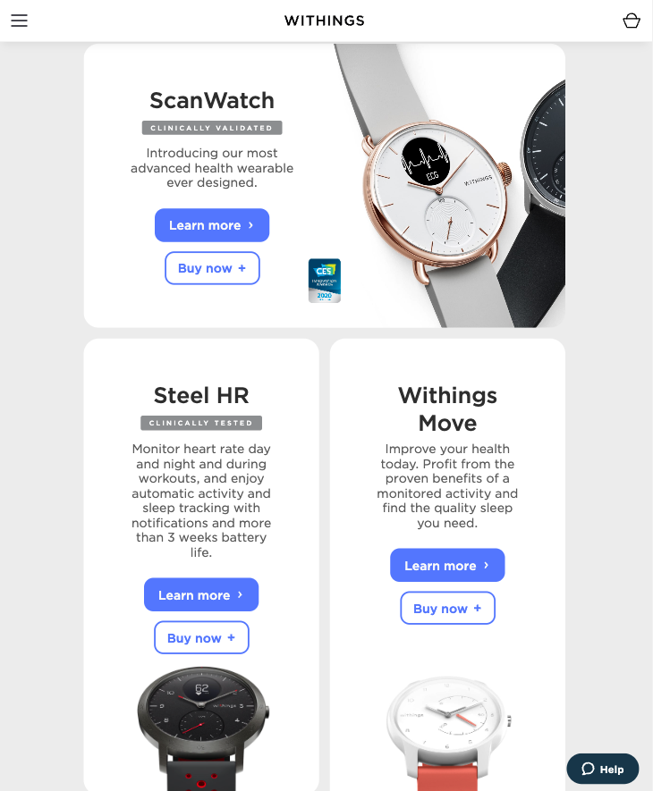
For an excellent example of a well-designed ecommerce category page, check out Withings.
This brand employs several tactics to ease page scanning. It uses headings for product names, visually segments the page with content blocks, and includes a vertical navigation menu to allow users to jump to the product they’re most interested in.
Source: withings.com
Featured product images
Another great thing you can do to ensure your product category pages convert is to choose featured product images with the highest chance of driving conversions.
There’s been plenty of research about product photography. One study, in particular, discovered that the secret to high-converting product photos is to show large key objects, use warm colors, high contrast, a high depth-of-field, and include a social presence.
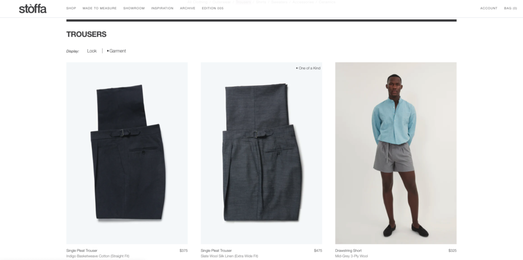
For instance, the Stoffa collection pages employ a hover effect that changes the product photo from a close-up to one with a model wearing the garment. It’s an elegant solution for displaying items in a way that’s guaranteed to appeal to website visitors without having to sacrifice the clean look of a minimal product collection page design.
Source: stoffa.co
Essential product information placement
“Less is more” is excellent advice for designing product category pages. And if minimalism (low visual complexity coupled with high prototypicality) is your aesthetic direction of choice, you can rest assured that you’ll see positive reactions from your target audience.
But here’s the thing. There are a few elements you should never allow yourself to skip on product collection pages. This includes:
- Item name
- Price
- Short description
- Rating (optional)
By making it easy for your web visitors to understand what you’re selling, you automatically increase their chances of recognizing a product as the solution to their needs.
Plus, information such as price, short product descriptions, and customer ratings boost the likelihood of potential customers moving onto the product page, increasing your chance of making a sale.
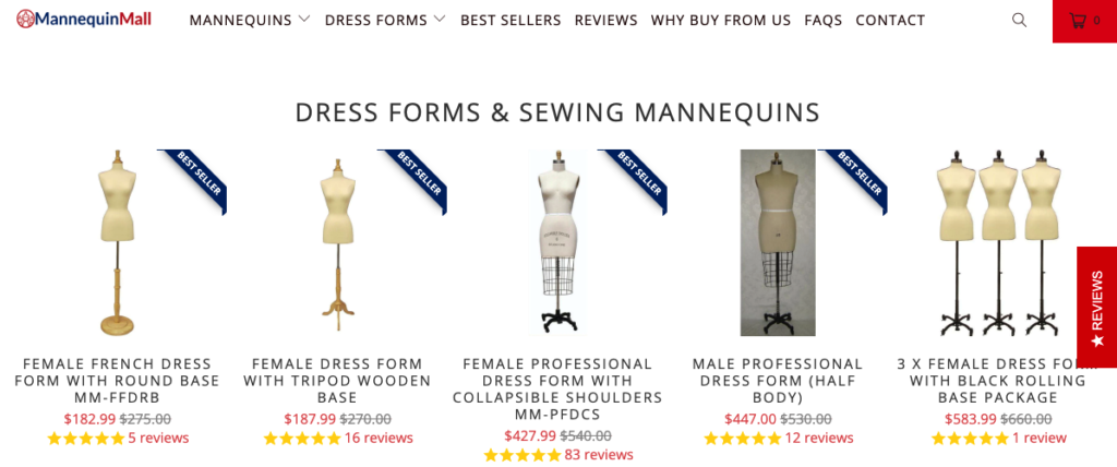
For example, look at the Dress Forms & Sewing Mannequins collections page from MannequinMall.
Here, you’ll see that the highlighted products directly communicate each item’s main features, price, and customer rating, making it super-easy for potential buyers to choose the product they need.
Source: mannequinmall.com
Product labels
If your store is filled with dozens (or even hundreds) of products per category, you might wish to utilize additional design features to highlight the items you want to sell.
One easy way to do this is with product labels that stand out and attract user attention to the main benefit of each item.
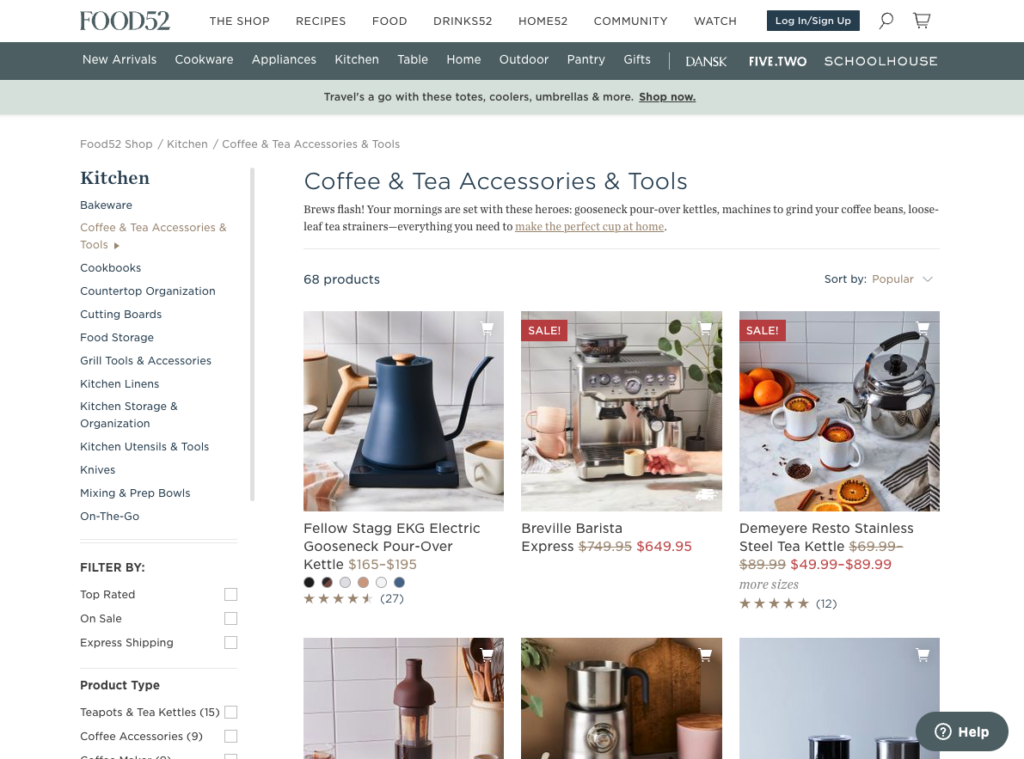
A quick glance at the Food52 Coffee & Tea page shows how effectively this brand uses a “Sale!” label to boost sales for select items.
The red color ensures sufficient contrast with the product photo, and the positioning and sizing are perfect, as they’re noticeable without overshadowing the main selling points of each item.
Source: food52.com
Banners, pop-ups, & additional design assets
Lastly, as you explore ways to employ ecommerce category page design hacks to boost conversions, don’t forget about the factors that inspire users to invest in a product.
For example, while studying the reasons why consumers choose to shop on Amazon in 2022, Statista discovered that:
- 40% of people go to this retailer due to low shipping prices.
- 37% use Amazon to gain access to fast delivery.
- 36% like the platform due to competitive prices.
So, if you know that today’s consumers want free and fast delivery, coupled with value for money (and a bit of sustainability in the mix), why not employ additional design elements to ensure people know you offer these perks?
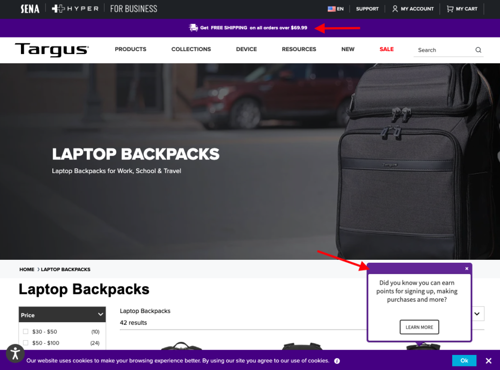
Targus does it splendidly by using a “Get FREE SHIPPING” banner and a pop-up inviting web visitors to join its rewards program.
Source: targus.com
Ecommerce Category Page UX & UI
Once you’ve nailed the visual appearance of your product collection pages, it’s time to move on to making UX and UI changes that will encourage web visitors to convert.
Admittedly, investing in UX and UI may not seem that important when aiming to boost conversion rates. However, research data shows you have plenty to gain by improving these aspects of your ecommerce site.
Adobe, for example, discovered that as many as 89% of web users would stop interacting with content due to UX issues.
Google’s data reveals that negative experiences on mobile cause 62% of people to make a future purchase from a brand.
And Marketing Charts found that 46.7% of people will tell their friends about a bad customer experience, 26.7% will complain to the company, 17.1% will share on Facebook, 11.1% will leave a bad review, and 8% will go to Twitter to vent their frustrations.
With this in mind, it’s truly worth exploring the best UX and UI practices you can adhere to when building high-converting ecommerce category pages.
Product category names
One of the easiest ways you can improve the user experience on your website is to come up with logical product category names that will allow visitors to navigate your site seamlessly and intuitively.
Don’t fall into the trap of trying to be witty or different with product category names. Chances are, you’ll settle on solutions that sound cool or funny but which won’t help your audience when trying to move from one stage of their shopping journey to the next.
Instead, go for solutions that are logical and helpful.
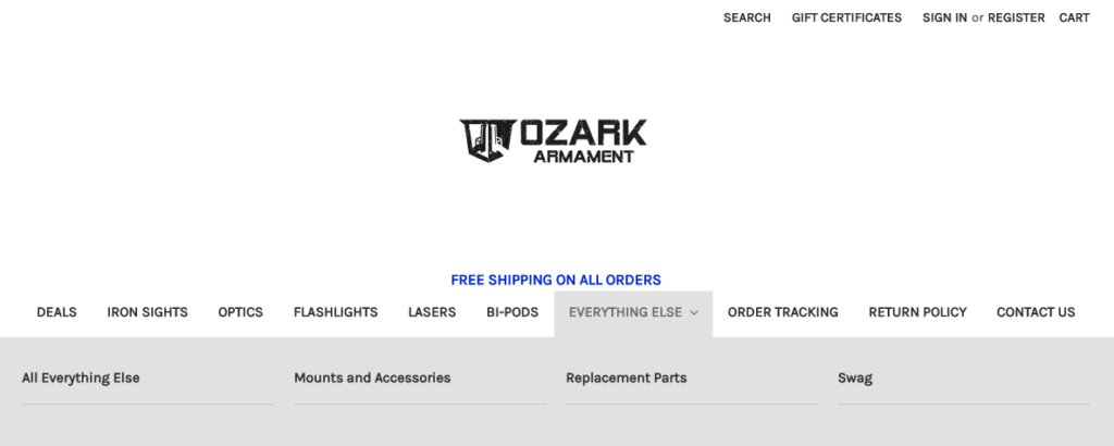
For example, Ozark Armament’s product categories include iron sights, optics, flashlights, lasers, and bi-pods. These may not sound unique, but they still do a perfect job of helping web visitors navigate to the page they’re looking for.
Best of all, check out how this brand also includes an “Everything else” category in its navigation menu, which, when clicked on, opens up a drop-down menu with four additional product types.
Source: ozarkarmament.com
But what if your target audience consists of a large group of people who may not have sufficient experience to know what your product categories mean?
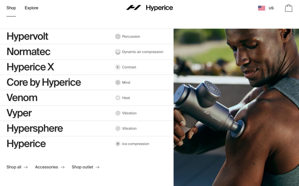
In this case, you could also choose to go in a direction similar to Hyperice.
This brand supplements its product category names with a simple explanation of what each does, making it easier for potential buyers to choose the therapeutic product suited for their needs.
Source: hyperice.com
Website Navigation & breadcrumbs
Another impactful UX design change you can make, which will make using your site more enjoyable (and therefore boost conversion rates), is to ensure that the navigation menu is easily accessible.
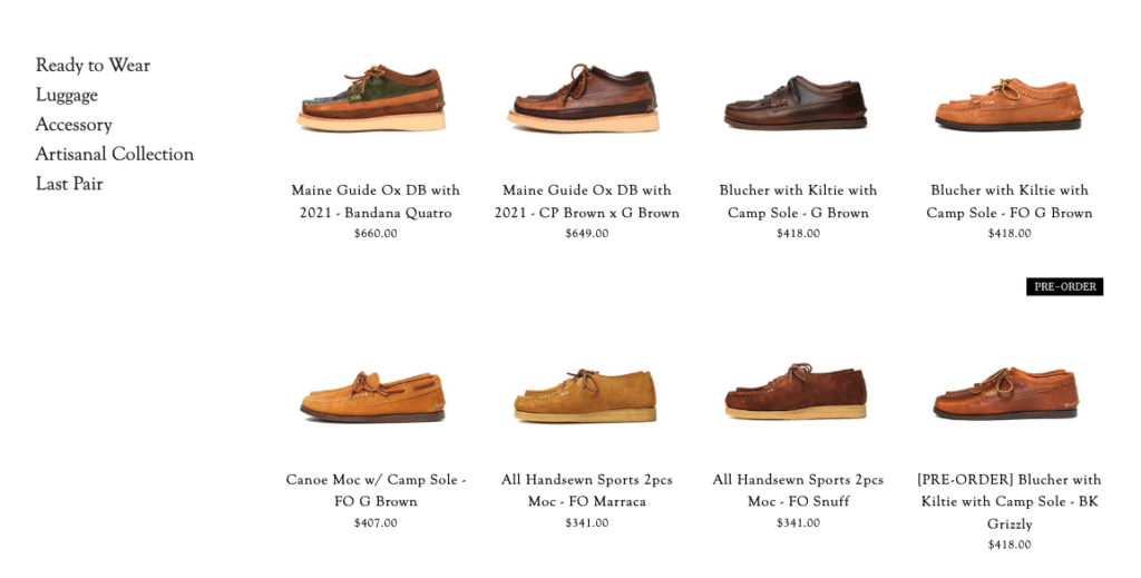
The Yuketen website, for example, includes a vertical navigation menu on the left-hand side of its product collection pages allowing buyers to quickly jump between product categories. (Note how the horizontal menu differentiates between different subcategories like moccasins, loafers, sandals, etc.)
Source: yuketen.com
Furthermore, you can also enable breadcrumbs to make moving between product categories and subcategories easier for your potential customers, as done on the Lowe’s site.
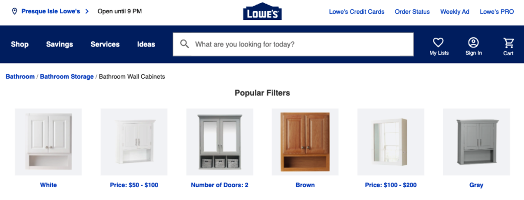
Source: lowes.com
Search feature
According to research from Forrester, 43% of ecommerce web visitors go directly for the search bar when landing on a website. Unfortunately, 42% of all retail websites have below-average search UX performance resulting in lower conversion rates, high bounce rates, and poor brand perception.
Knowing that your site’s search feature could determine whether a website visitor turns into a loyal customer or bounces and goes on to buy from your competition, it’s safe to say that focusing on it is worth the invested time and money.
Product filters
Another UI element you should definitely consider adding to your product category pages is, of course, a robust filtering system.
Depending on their position in the SEO sales funnel, your web visitors may be looking to browse products in search of inspiration for things to buy.
However, while this is how some people interact with ecommerce stores, don’t forget that those who know what they need won’t have the patience to scroll through pages and pages of content until they identify the items that match their criteria.
Fortunately, product filters can help you remove those frustrations, encourage web visitors to stick around for longer, and drive conversions.
In addition to the traditional sorting and filtering options, consider whether any creative solutions could benefit your target audience.
Transparent Labs, for example, found that including fitness-goal-related filters simplified the purchasing process for its audience, ensuring higher conversion rates and an overall better customer experience. If you choose the pre-workout category, for example, you’ll land on their Pre Series product page; from there, you can further refine your search using filters on the left-hand side.
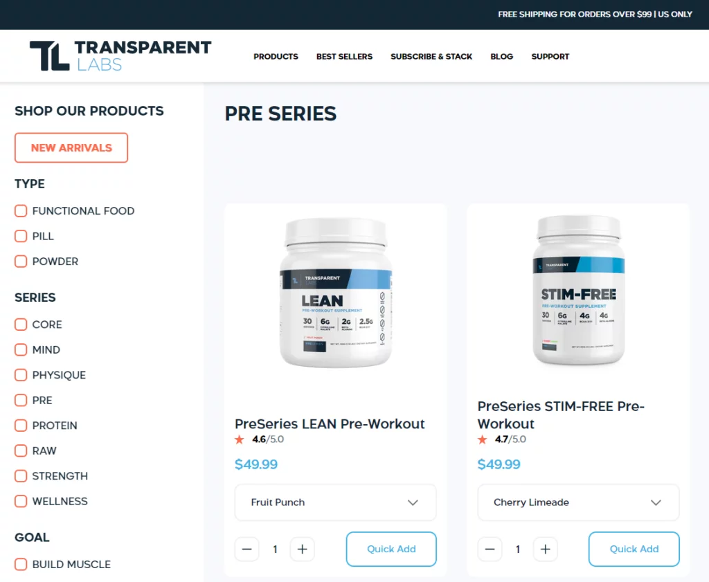
Source: transparentlabs.com
Advanced Conversion Rate Optimization Hacks for Ecommerce Category Pages
You’ve covered your bases and are ready to explore advanced strategies for boosting conversions on your product collection pages. But where do you start?
Well, chances are, one of the following tactics will help you boost your conversion rates from the industry median of 5.2% and get you closer to the top performers in your niche.
Browse abandonment strategy
One of the absolute best ways to boost conversions on product collection pages is, of course, to combine your existing marketing activities with advanced tactics.
Implementing a browse abandonment strategy, for example, could allow you to reach email newsletter subscribers who’ve viewed your pages but haven’t made a purchase.
According to Klaviyo, browse abandonment emails deliver a conversion rate of 0.92%, which is a significant gain if you consider that they’re a fully automated approach to marketing.
But even more importantly, you must understand that this simple hack could allow you to boost your customer lifetime value, re-engage one-time shoppers, and encourage brand loyalty (which is not easy to do in a world where customer loyalty is on the decline).
Product comparison features
Most consumers do in-depth product research before making a purchasing decision. But did you know that as many as 40% use ecommerce websites to compare products?
That’s right. Including even an elementary product comparison feature could allow you to boost conversion rates on your ecommerce category pages.
For inspiration on how to add product comparisons to your site, you can look to Apple, whose “Compare” page includes plenty of information to help customers choose the best product for their needs. Of course, note how Apple also adds a “Chat with a specialist” CTA button to the page, inviting potential buyers to get advice from one of its sales experts.
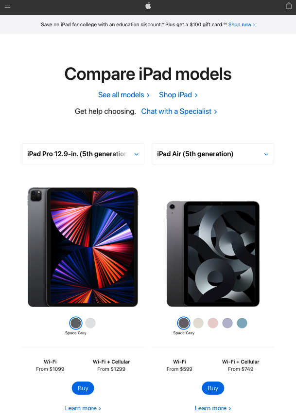
Source: apple.com
Social proof & trust elements
Finally, as you look for tips that will help you build high-converting ecommerce category pages, don’t forget that adding social proof and trust elements to your pages could help you achieve the CR boost you’re after.
After all, if 99% of shoppers read reviews when purchasing online, failing to use at least some social proof on your product collection pages would be unwise. Of course, to ensure that you get the best possible results, choose the approach to social proof that works best for your brand.
On the one hand, you could do something similar to the Emile Henry website. Here, the bottom section of the category page is reserved for trust badges promising secure payment, fast delivery, and a 10-year warranty.
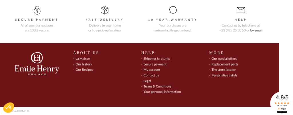
Source: emilehenry.com
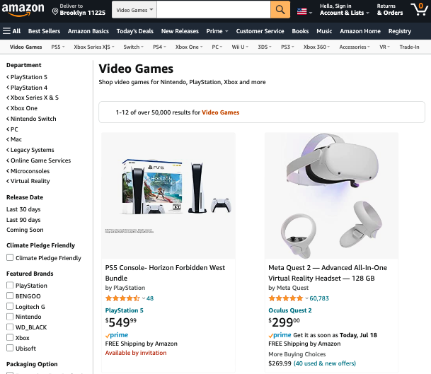
On the other hand, you could also take inspiration from the world’s most successful ecommerce store — Amazon — and simply integrate star ratings into how you display different products on category pages.
Source: amazon.com
Wrapping Up
Boosting conversions on an ecommerce website is never a straightforward process.
More often than not, it requires you to make incremental changes and be super-diligent about testing their impact to see whether you’ve made the right design, UX, UI, and CX decisions.
However, while there may not be a single formula that will guarantee that your category pages have the highest CR in your niche, the best practices listed above are sure to help.
So don’t put off implementing them on your website. And, of course, make sure that you keep an eye on your analytics. Because in the end, the only way to know if a strategy is working is to test it and make your final decision based on proven data.
