The Anatomy of a Killer Ecommerce Product Page
If you’re looking for ways to elevate your ecommerce business to the next level, you may be thinking about updating your website’s design. And that’s no surprise. After all, getting the visual aspect of your site just right is guaranteed to positively impact your business.
A well-designed product page can ensure you leave a favorable impression on your target audience. It can drive customer trust. And (perhaps most importantly) it can allow you to maximize your conversion rates and even increase the AOV and revenue in your ecommerce store.
But what goes into designing an ecommerce product page that drives sales? This guide looks at the anatomy of a killer ecommerce product page, teaching you how to get it just right so that your business can enjoy the benefits of employing exceptional design.
Let’s dive in.
Layout, User Interface, & User Experience
The first three elements you need to focus on when designing an ecommerce product page are the layout, user interface, and user experience. Directly speaking, these make up the basis of any well-made web page.
Yes, you can (and perhaps even should) apply your brand’s stamp or experiment with unconventional choices.
But at the end of the day, a product page that’s well laid out, that makes interactions seamless for your audience, and that eliminates the common frustrations buyers encounter when shopping online is going to be the foundation of your store’s success.
Reading & Page Viewing Patterns
Research shows web users view web pages according to several specific viewing patterns.
So, by taking these viewing patterns into account when coming up with the layout of your product pages, you can create a visual hierarchy, ensure that your web visitors notice high-impact elements, and actively nudge them towards making a purchase.
For ecommerce product pages, your best bet would be to utilize one of the following page-viewing patterns to inform your layout design.
The F-Shaped Pattern
According to eye-tracking research from the Nielsen Norman Group, one of the most commonly exhibited online reading behaviors of the past two decades is the F-shaped pattern.
This pattern is characterized by visual fixations at the top and left side of content segments on web pages, with mainly horizontal eye movement and a tendency to prioritize information communicated towards the beginning of page sections/sentences.
According to usability experts, the F-shaped reading pattern is caused by poor or inexistent formatting text, coupled with the users’ need to consume content more efficiently. It indicates a low level of commitment on the user’s part and may even be a sign of disinterest.
Now, this information may seem worrying. After all, if the F-shaped pattern means that your audience is disengaged from the content on your site, why would you ever use it on your product pages where your main goal is to boost sales?
The truth is that presenting information by following this layout can help you bypass that very same obstacle. It gives you a unique opportunity to ensure your website visitors notice key product features and benefits and ensures that you capture the attention of even those potential customers who still inhabit the top stages of the sales funnel.
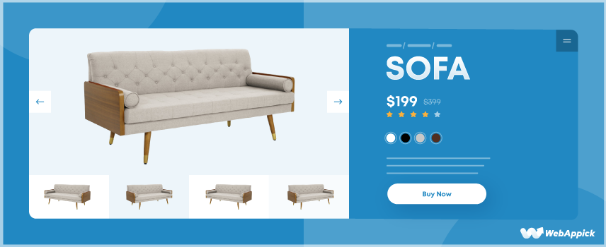
This is why leading ecommerce websites like Amazon and Nordstrom use this precise pattern to display textual information, helping web visitors scan the pages for relevant info & find what they’re looking for with speed and ease.
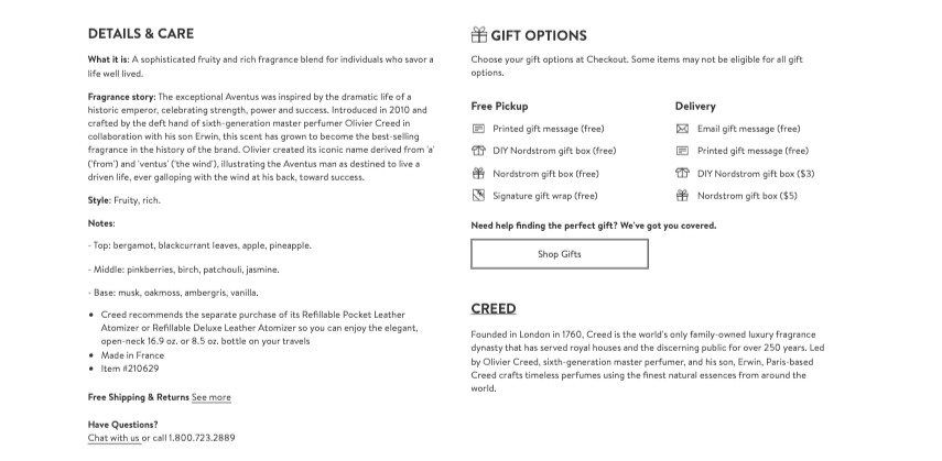
Source: nordstrom.com
The Z-Patterns & Lawnmower Pattern
The alternative to the web’s most popular layout pattern is something slightly more modern, which accounts for the fact that the vast majority of today’s product pages contain images or distinct content sections.
With the Z and lawnmower viewing patterns, the idea is that users’ attention while viewing web pages will move back and forth, most commonly allowing them to alternate their focus between visual and textual elements.
The goal of these two patterns is usually to permit readers to compare two or more products.
However, it can also be argued that how these patterns utilize visuals allows web visitors to consume content more efficiently.
In other words, they provide extra processing time as readers move from text to related visuals and back to a new text section again.
To see this type of layout in action, check out the example from Apple below.
You’ll see that the product page design clearly favors the Z-pattern for displaying information, encouraging the potential buyer to compare the two products, and choose the one that will match their needs the best.
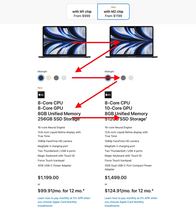
Source: apple.com
The Amerisleep product page below, on the other hand, chooses a slightly different approach with the lawnmower layout pattern, which is, in this case, suited for discussing advanced product features without having to address them all within a single block of text.
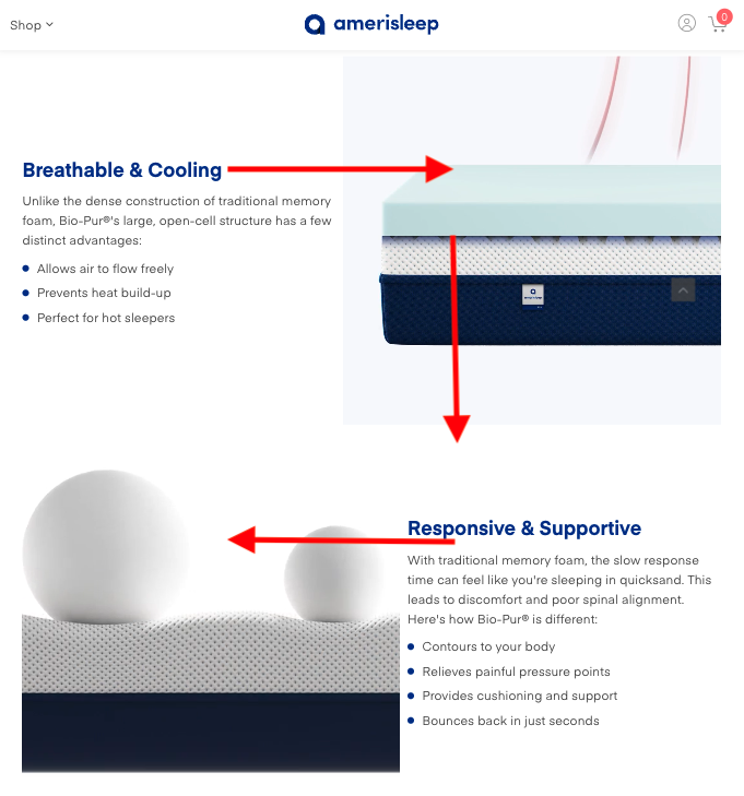
Source: amerisleep.com
The Gutenberg Diagram
Finally, discussing layout patterns without mentioning the Gutenberg Diagram would be impossible.
Sometimes referred to as a layout that appeals to users with “a genuine interest in the page content,” this type of design resembles the Z-pattern.
However, it extends on the Z-pattern by defining the areas of the screen based on how much of the user’s attention they attract.
According to the Gutenberg Diagram, the top left corner always represents the Primary Optical Area (the spot where web visitors look first).
It’s followed by the Strong Fallow Area, which provides a follow-up to the first section.
Then, the lower-left corner is the Weak Fallow Area, which doesn’t add much to the first two sections.
And finally, the last part of the page is the lower right corner, referred to as the Terminal Area, where users need to take action (and where you should place your CTAs).
If you take a look at the Sonos product pages, you’ll see that they actively utilize the Gutenberg Diagram to determine the layout:
- The Primary Optical Area features the product photo.
- The Strong Fallow Area is where the product name, price, and rating are located.
- The Weak Fallow Area is left empty.
- The Terminal Area contains the most crucial element of the page — the CTA button.
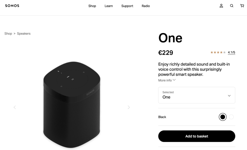
Source: sonos.com
Call to Action Buttons
So, you’ve decided on a page layout that establishes a visual hierarchy and guides your website visitors’ attention towards the highest value elements on your product pages. Or, perhaps you’ve chosen a theme that does this for you.
Either way, now is the time to start thinking about those high-value elements.
CTA buttons are where conversions happen on your product pages.
So, it’s only natural that you should dedicate some time to optimizing them in a way that will encourage those conversions.
Generally, there are some fundamental rules that ensure you’re driving sales with the CTA buttons on your ecommerce website:
1. Pay attention to positioning
Eye-tracking data reveals that web visitors spend 57% of their viewing time above the fold.
So, the CTAs (on both your product and landing pages) should be visible in the first screenful.
If you check out the Fear of God website, you’ll see that this is what the ecommerce store does, prioritizing the position of the CTA button and leaving the scrolling to those users who wish to learn more about the product.
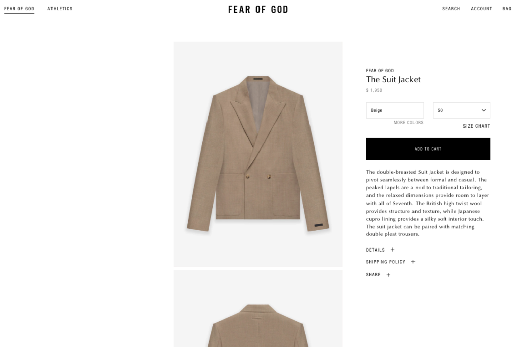
Source: fearofgod.com
2. Color & contrast
To guarantee that your CTA buttons attract web visitors’ attention, you need to use color and contrast wisely. This will help them stand out from the background.
Generally, the best way to do this is not to rely on traditional red vs. green color choices.
Instead, use a color wheel tool and pick a hue that will sufficiently stand out on your product pages.
3. Negative space
Another super-easy thing you can do to guarantee your calls to action stand out is to envelop them with empty space.
This doesn’t just allow them to stand out. It could be argued that negative space attracts user attention to the button and communicates its importance (and the value your potential customers stand to gain by clicking on it).
User Interface
Finally, as you look at the bases of a killer ecommerce product page, don’t forget that a website that encourages conversions always provides a user-focused interface.
So, don’t forget to include helpful and convenient UI elements to your site, which will help you secure the results you’re after.
Generally, the best way to ensure your web visitors have a pleasant online experience in your store is to try and find ways to make their interactions seamless.
For example, this can mean including a search bar in the top right corner of your website and making sure it’s always visible.
Or, if you’re focusing solely on making your product pages user-friendly, it can mean:
- Creating an easy way for buyers to select a garment/product size.
- Allowing visitors to get in touch with your customer support team with a single click.
- Including a feature that helps potential buyers find an item at your brick-and-mortar store.
- Allowing web visitors to read your shipping and returns policies right on the product pages.
- And, of course, a highly-visible CTA button inviting consumers to add an item to their cart.
A quick look at the Tod’s website shows that this brand’s product pages do all this, with a slightly atypical UI that, above everything else, prioritizes UX and, consequently, encourages conversions.
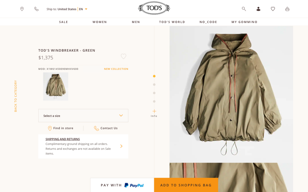
Source: tods.com
Ecommerce Product Page Copy
Once you’ve gotten the skeletal structure (the layout, UX, and UI design) of your ecommerce product page covered, it’s time to start working on the muscles and ligaments which keep everything together.
In other words, it’s time to start optimizing your copy.
As you’re probably well-aware, well-written website copy sells.
Emotional, assertive, and inspiring language allows you to drive conversions, as it appeals to your audience’s innate purchasing behavior, which dictates that (most) humans make buying decisions based on feelings.
Of course, this doesn’t mean that you should forget about facts and focus solely on inspiring your target audience to buy your products (although brands like Coca-Cola and Dollar Shave Club both do it spectacularly).
But, they also do offer some pretty good pointers for presenting product features in a way that actually resonates with your potential customers.

Source: youtube.com
Generally, if you’re trying to put together a killer ecommerce page copy, there are three rules you must follow:
Focus on the Benefits
When writing ecommerce copy that sells, your primary task is not to get hung up on your product’s features.
Now, this can be a difficult thing to do. After all, you’ve probably spent months (if not years) in R&D, trying to design product features that will help your audience solve their pain points.
But, the harsh truth is that most people don’t care about tech specs. Instead, they want to know how they will benefit from buying an item.
So, as you start composing a copy for your ecommerce site, make sure you do it from your target audience’s point of view.
For an excellent example of how to do this, you could take inspiration from Samsung.
This brand doesn’t advertise that its latest Frame TV uses QLED technology, which can “produce 100% Color Volume in the DCI-P3 color space, the format for most cinema screens and HDR movies for television.”
Instead, it points out that the TV allows buyers to enjoy a “billion shades of brilliant color.”
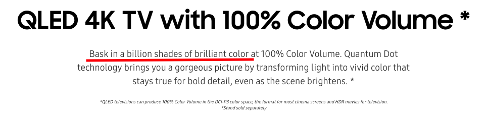
Source: samsung.com
Or, for a slightly different way to address technical specifications in a benefit-oriented way, check out KURU Footwear. This brand’s product pages clearly list features in its hero section as shown below.
However, instead of just saying that KURU sneakers contain, for example, KURUCLOUD midsoles, the copy points out that the intention of this product element is to absorb shock, improve alignment, and prevent plantar fasciitis pain.
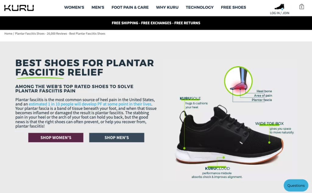
Source: kurufootwear.com
Maximize the Readability
Once you’ve figured out what your copy needs to communicate to boost conversions, it’s time to focus on the how.
Generally, a rule of thumb for writing exceptional ecommerce product page copy is to prioritize accessibility by maximizing readability.
However, if you’re a beginner copywriter (or just a fan of Oscar Wilde’s style), you might find yourself at a loss for how to do this.
Fortunately, achieving accessibility by boosting readability is super simple.
All you need to do is to keep your copy short, simple, and sweet.
No, this does not mean omitting important product information.
Rather, it means finding better ways to explain complex concepts.
You can do this by:
- shortening your sentences and paragraphs
- skipping niche jargon and choosing more audience-friendly language
- breaking up your copy into more sections
- employing visuals wherever possible, and
- using formatting to guide user attention (more on this in next section).
Once you’ve finished your first draft, the best way to check its readability score is to put it through a word processing tool like Grammarly or Hemingway.
These apps will help you eliminate grammatical and stylistic mistakes.
Plus, they will tell you how your copy scores on the Flesch reading-ease text.
Generally, you should aim for a 60-70 (8th grade) readability score, which will ensure your product descriptions are understood by 80% of English speakers.
If you’re trying to find a stellar example of a product description that’s accessible (without leaving out any essential details about the item), check out this product page by Rocky Mountain Soap Company.
A quick check shows that the copy on this page is easily understood by anyone with a 7th-grade education.
A closer look reveals that the copywriting team intentionally left out technical terms and chemical compounds, describing the ingredients in words that most people will understand.
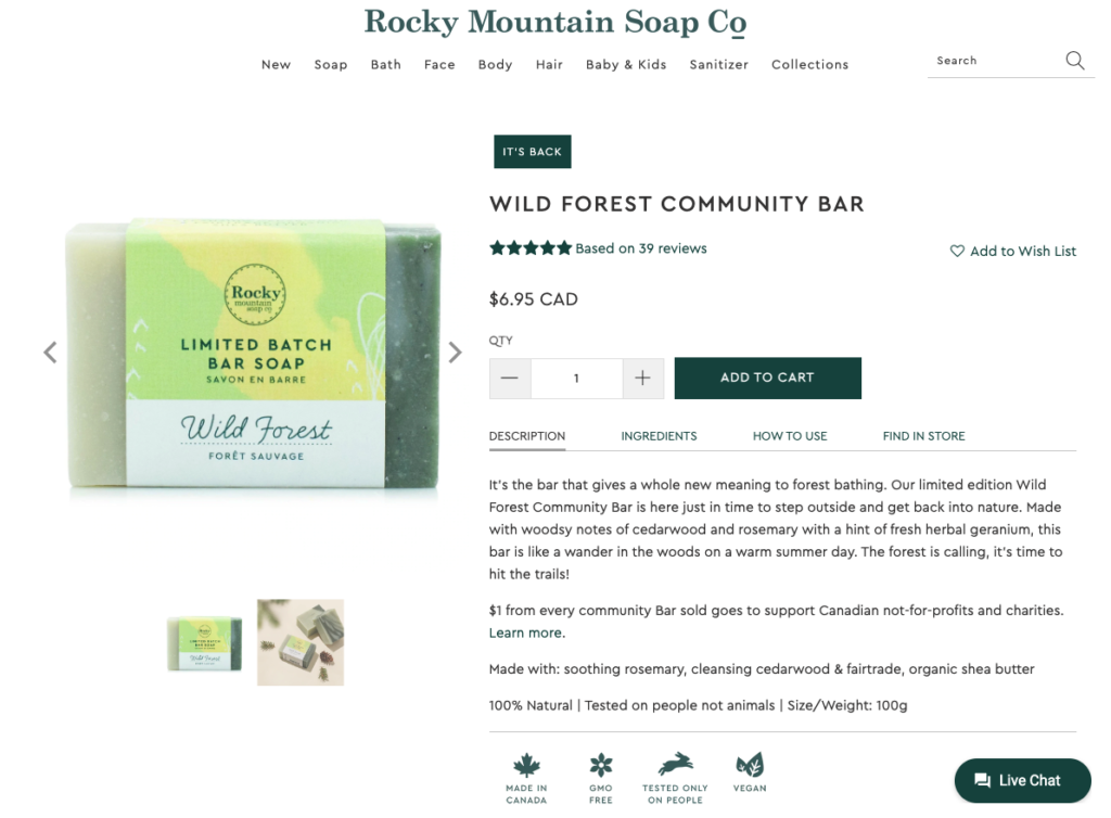
Source: rockymountainsoap.com
Attract and Guide User Attention With Smart Formatting Practices
The last copywriting tip that will help your ecommerce product pages outperform the competition is to make good use of formatting options.
Because they add a visual aspect to the text on your website, formatting options can help you significantly boost readability.
Moreover, they can draw web visitors’ attention to certain words or phrases.
And, they can help you emphasize select product benefits, ensuring that your target audience understands the value offered by your brand.
If you’re not sure how to get started with formatting, here are a few tips you can easily follow:
1. Heading styles are essential
By highlighting the name of your product and different benefit sections with headings, you can help web visitors zoom in on the important stuff.
This helps them avoid wasting time on information they consider irrelevant.
Plus, it lets you point out user benefits your audience may not have expected to receive by purchasing your products.
2. Use bullets or numbering
This simple tweak allows you to break up long paragraphs and makes your content scannable.
3. Choose a user-oriented font
Generally, the simpler the font, the easier it will be for users to read your text.
Design experts agree that commonly-used fonts like Times New Roman, Arial, and Verdana perform well in terms of readability.
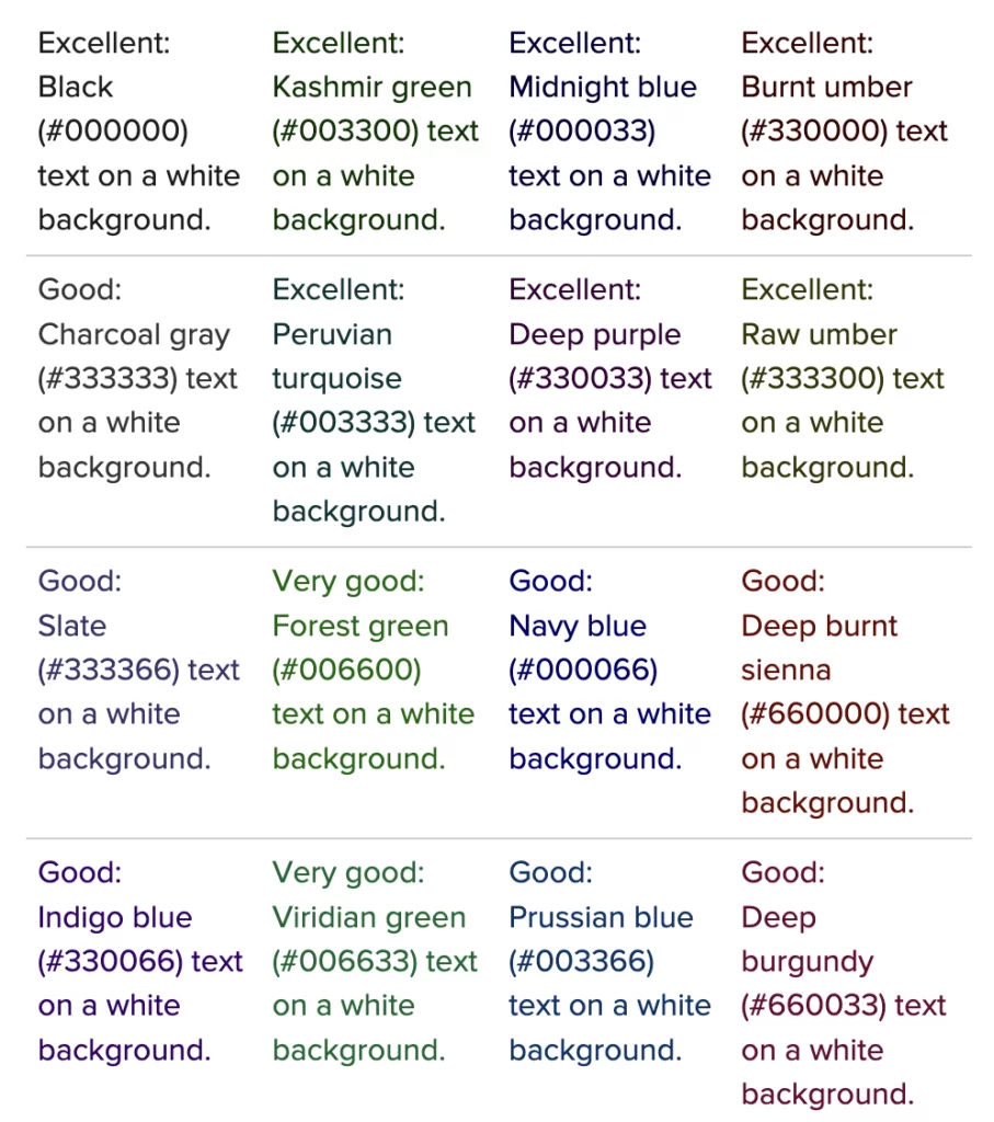
4. Contrast is key
Like CTA buttons, your product page text needs to stand out from its background.
To play it safe, go with black letters on a white backdrop.
However, if you want to infuse your product pages with some excitement and use a colored font, check out the cheat sheet below.
Source: uxmatters.com
Ecommerce Product Page Visuals
Now that we’ve covered the structural elements that will help you turn your ecommerce product pages from average to exceptional, it’s time to address the heart and soul of any high-performing online retail website: visuals.
When choosing what products to invest in, most consumers take the time to examine items for looks, quality, and usability.
But, the problem with online shopping is that it doesn’t always provide sufficient information (especially since tactile interactions are off the table) to convince potential buyers.
Fortunately, imagery can help online retailers overcome this (substantial) obstacle.
There are, of course, dozens of visual formats you can use in your ecommerce store, which will all help you drive conversions. However, the truth is, you don’t have to go overboard and employ all of them.
Instead, focus on getting a couple of them right, which will be more than enough to deliver results.
Product Photography
When shooting images for your ecommerce store, your primary focus should be on the quality. You don’t have to hire a professional to do it, nor invest in expensive equipment.
However, something as elementary as shooting images in a high resolution and making sure that the focus is sharp will help you impress website visitors.
If you’re looking for a more science-based approach to product photography, this study from 2014 breaks down the attributes of appealing product photos.
As for inspiration, the Net-a-Porter website is always a great place to head to if you want to see how exceptional product photography looks.
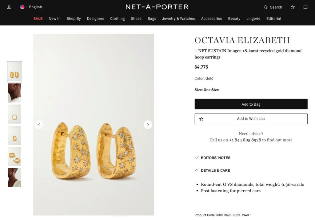
Source: net-a-porter.com
360° View
Another visual strategy that can help you impress your audience with product photography is using new technologies like 360° view and AR.
As these allow a closer look at your products, give shoppers a chance to see items in their own space (IKEA has been doing a great job with this for the past few years), and encourage engagement on your product pages, increasing the chances of visitors turning into buyers.

Source: ikea.com
Video
Did you know that consumers are becoming more and more used to learning about products by watching videos?
A recent survey reveals that 73% of buyers prefer to watch a short video than read a product description to learn about an item’s characteristics and benefits.
User-submitted Visuals
Finally, as you choose what product photos to include on your ecommerce site, don’t forget to leverage User Generated Content (UGC).
Research shows that almost two-thirds of consumers are more likely to purchase a product if they can view user photos and videos.
So try to figure out ways to make user-submitted visuals a part of your ecommerce pages.
You could automatically embed social media posts that use a pre-defined hashtag.
But, for a slightly more elevated approach, you could also allow your happy customers to include visuals in their product reviews.
You can then highlight the UGC on product pages, making the shopping process easier for those of your potential customers who are still on the fence about making an investment.
This is what GILI Sports does, and the results are visually spectacular.

Source: gilisports.com
Trust Elements
If your product page design journey ended at nailing the layout, user interface, UX, writing exceptional copy, and including high-quality product photos on your website, you’d be good to go.
However, considering the competition involved with running an ecommerce business in 2022, you should probably try to add a few page elements that will give you an edge over the other brands in your industry.
And according to research, a variety of trust elements could just be the thing.
Of course, there are countless ways to build trust and credibility for your online business. However, if you’re looking for the biggest bang for your buck, the following four are the ones you should pay the most attention to:
Trust Badges & Custom Trust Icons
These graphic elements pack a lot of punch in a small package.
How?
Because they communicate an easy-to-notice, no-frills message regarding the reliability of your business, they’re super-effective at helping you boost credibility and authority on product pages.
Plus, if they show that your products/services are certified by a third-party entity, they’re more likely to convince on-the-fence buyers to convert.
Of course, there are several directions you can go when it comes to trust badges. On the one hand, you can simply source them from service providers like PayPal, Norton, or Visa.
On the other hand, you can go slightly more over the top and create your own — as done by GetSafe in the example below.
Source: getsafe.com
Displaying Shipping & Returns Policies
What makes consumers choose to purchase items with a particular online retailer?
If you check out the statistical data, you’ll find that free delivery ranks first, with 53% of people choosing it.
And, user-oriented returns policies rank fourth, with 33% of buyers prioritizing this factor.
So, you should definitely look for ways to leverage shipping and returns to build trust for your ecommerce store.
One easy way is to link the relevant policies in a visible spot on your product pages.
By the way, if you want to be extra about it, you could also go with something slightly more complicated, like this shipping and money-back guarantee page section on the SomniFix website.
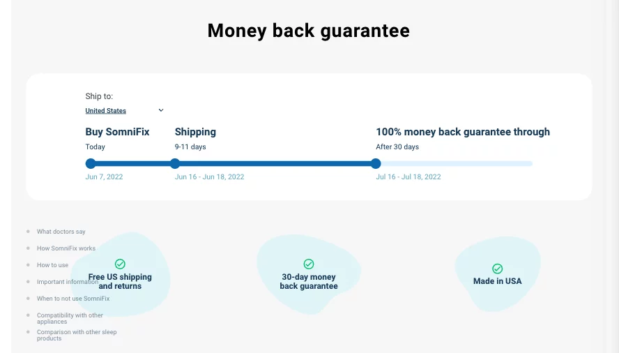
Source: somnifix.com
Social Proof
Finally, as you explore methods to prove to your customers that they can count on your business to deliver on its promises, don’t forget about the persuading power of social proof.
Make sure that your product pages show ratings, reviews, or even advanced testimonials — like the video on ClickUp’s homepage.

Source: clickup.com
Elevating the Customer Experience
Last but not least, as you look for ways to perfect your ecommerce product pages and help them engage and convert web visitors, don’t hesitate to explore and experiment with advanced or even uncommon page elements.
Sure, a lot of them won’t be present on your competition’s sites. However, the very fact that you’re the only one in your niche doing a particular thing might just be the thing that helps you win more sales.
Of course, what constitutes an advanced website design made to deliver an exceptional customer experience varies from brand to brand.
One company might find that the key to delighting its audience is to allow product personalization — The Daily Edited has got a great thing going on its website.
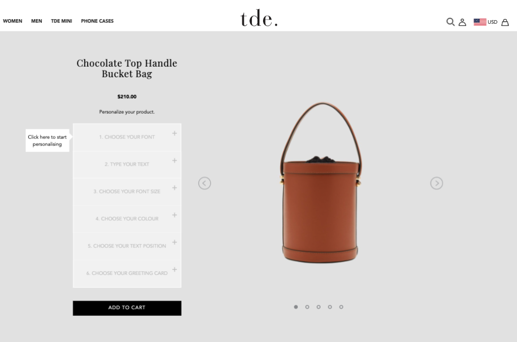
Source: thedailyedited.com
Or, you might discover that delivering an exceptional customer experience doesn’t have to rely on overly-complicated web development.
Sometimes, the key to helping your customers enjoy the shopping process means something as simple as making your product specifications easy to find and understand, as done on the Fire Pit Surplus site.
As for other elements you can use to elevate the customer experience on ecommerce product pages, don’t overlook the positive impact of a related knowledge base, an informative FAQ section, or even the helpfulness of a well-made cross-selling feature, like the one on the Officine Générale site.
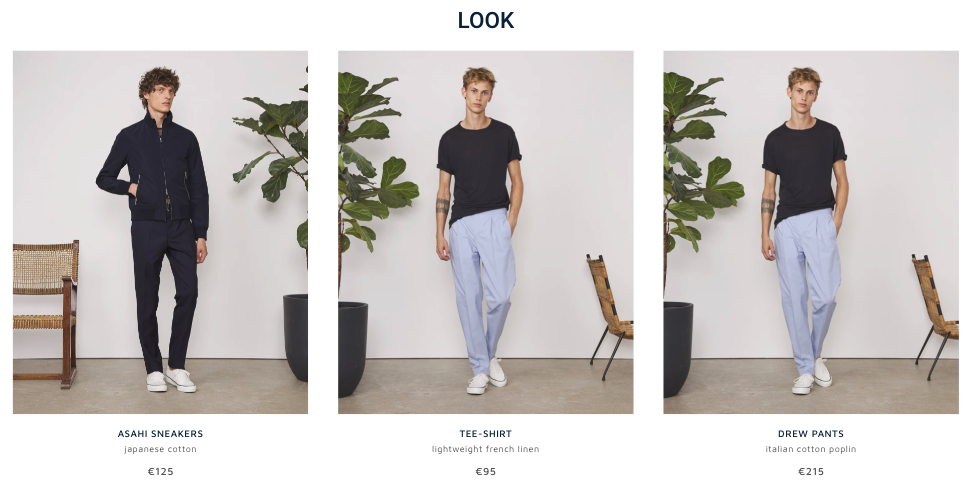
Source: officinegenerale.com

Final Thoughts
Now that you understand the elements that make up a killer ecommerce product page, you can start making any necessary changes to your online store.
You might find that your product pages already contain all of these conversion-boosting elements. Or, you might discover that you still have a fair bit of work ahead of you.
Whichever the case, don’t rush the process. Cover your bases first. This means the layout, UI, UX, copy, and visuals.
Once those are perfect, you can start adding advanced elements like trust signals, CX widgets, or UGC.
And, of course, whenever you’re in doubt about whether a design choice is bringing results: test.
Even something as simple as making design tweaks and looking at how they impact your KPIs will be enough to inform you about whether you’ve made the right choice.
And, if you find that a particular design strategy isn’t working for you, don’t be afraid to think outside the box. After all, exceptional design is based on a balance of uniqueness and familiarity. And the only way to find that balance is to try out new things.
